We’ve enhanced the Skill Category charts on Skills Base dashboard to provide you with additional valuable insights into the capabilities of your teams, roles, locations and people.
The enhancements combine elements of the Capability Matrix to show skill level along with the spread of skill levels (capability) within a given skill category:
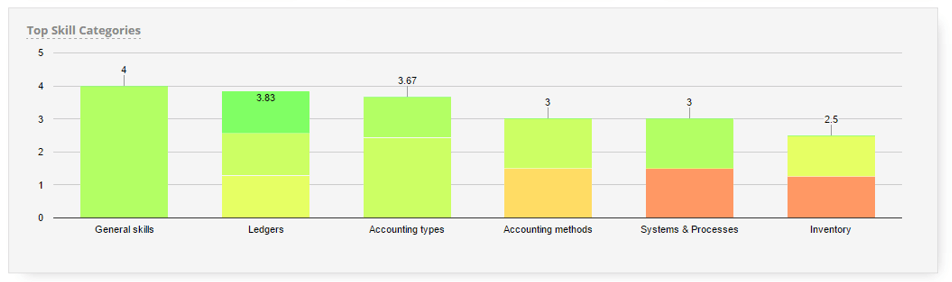
The chart coloring has been upgraded to match the Heat Matrix report color scheme to allow you to quickly identify the skill level spread for each skill category, which is particularly useful for highlighting areas of concentrated high or low skill level.
The chart is also now sorted like the other dashboard lists, in descending order of skill level, to allow easy identification of the top skill categories for a given entity.
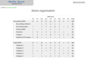
In parallel with these enhancements we have also added skill category grouping to the Capability Matrix report, to enable reporting at the category level, for times when reporting at the skill level is too detailed:
We hope these enhancements help you derive even more value from your skills management practice. As always, if you have any feedback please feel free to contact us at any time.